Give Now


Category Archives: Object of the Month.2019

Object of the Month: December 2019

Triptych: Nativity, Adoration of the Magi, Flight into Egypt

Oil on panel

Jan Swart van Groningen

Flemish, c 1500-1560

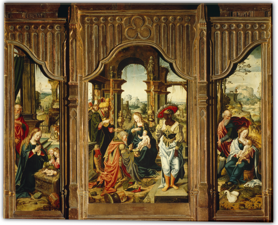
As his name states, Jan Swart came from the town of Groningen in the Netherlands. No documents tell of his training, but this painting depicts his fondness for showing people in unusual headgear. It also reveals his other work as a book illustrator. Here Swart pictures the central truth of Christ’s coming into the world, placed within the context of His early life. 

M&G’s Triptych (three panels) illustrates three events in Christ’s early life: the Nativity, Adoration of the Magi, and the Flight into Egypt. The birth of Christ signified the coming of a new covenant—a covenant that forever removed the necessary demand of the Old Testament Law requiring atonement for sin before the joy of reunification and fellowship with God. 

Swart unifies the three stories of the triptych through a key motif: broken architectural elements. The left panel (clearly the stable with a curious cow in the background) has the Christ-child lying on a manger of ornate stone, possibly the base of a larger pillar. But the broken pillar at the base of the marble manger (right foreground) catches the viewer’s attention because its decoration is too fine to be part of a stable and because it matches all the other pillars, especially the broken one in the foreground of the Adoration. In the Flight, the Madonna and Child are resting on a pillar’s base by the side of the road. In each panel then, Swart uses the broken columns to point to Christ’s reason for coming to earth. 

However, Swart develops his illustration of the Scriptures even more, specifically within the large, middle panel. The Adoration is central to an understanding of that New Covenant that Christ came to establish. To appreciate his storytelling, one must carefully consider the motif of the number 3.  

Three in Composition

Swart adorns the frame of the middle panel with a trefoil centered over the Madonna and Child. This iconography tells the viewer that the scenes are the story of the One God in Three Persons, the Trinity of which Christ is the second Person. Swart then emphasizes this truth through more tripling in the work. There are three openings in the room, which is clearly not a stable. In doing so he follows the same Scriptural distinction that the Magi came to “the house where the young child was.” Interestingly, each opening emphasizes a key character in the story: 

  • The left doorway holds the third magus as well as some other apparently well-to-do men, based on their clothing. 
  • The middle opening, framing the Virgin’s head, shows some soldiers in the background. Their presence alludes to Herod’s men, who were tasked with murdering the male infants in Bethlehem to prevent Christ from becoming king—the reason the family fled to Egypt.
  • The right opening frames a large building in the distance with townspeople going about their business, unaware or uncaring about the visit of such prestigious visitors to their village and to the Savior of the world. The full, frontal view of the first magus in his ostentatious dress already makes him a focal point, but the opening behind him seems to frame him as if he were posing for a portrait. 

Three Gifts

Swart does not include Joseph in this panel, though Christ’s earthly father is often part of this family scene. The reason is that the focus is on the heavenly family of the Christ. The three gifts of the magi emphasize a different family than that of Joseph’s. 

  • Gold is a gift for a king and points to Christ’s position as the King of heaven who will be rejected and killed by His lawful subjects. 
  • Frankincense, a gift for deity, represents the fact that Christ is the God of heaven who will not only be the priest who offers the sacrifice for sin but will also be the sacrifice itself. 
  • Myrrh is a burial oil symbolizing the death that will be necessary to establish the New Covenant of grace. It also emphasizes the unbelievable story of the Christ: The King of heaven and the Creator of the world will die for those who owe Him everything and will allow them the exercise of their free wills to reject or accept Him. 

Christ’s lineage through Joseph is that of the kings of Israel, perhaps another reason that he is not present: Christ’s royal claim to these kingly gifts relies on His eternal lineage, not that of His earthly father’s. 

Three Magi 

The three holders of the gifts are also interesting to note. Those held by the two Magi on the side are urn shape, commensurate with their gifts of oil. Logically then, the wide-mouthed lidded bowl offered by the central magus is the gold: the kneeling pose and the type of gift indicate the submissiveness of a subject to a king. Christ’s pose and gesture indicate His position as both king and priest in extending a blessing to His subjects.

Three Columns

The three ornate pillars within the middle panel are interesting as they are in differing conditions. The pillar in the foreground matches the one in the stable. But the other two frame the Christ and His mother. Perhaps Swart is showing the progressive nature of the New Covenant’s institution. One column is broken, another is empty, and the third fulfills its purpose. Christ must be born, die, and resurrect in order to complete the New Covenant. Swart again uses the number three to tell the story of Christ, even as an infant, has set in motion the redemption of the world. 

Dr. Karen Rowe, M&G Board Member


Published in 2019

Object of the Month: November 2019

Schrank

Walnut and pine

German, 17th century

Storage has been one of humanity’s challenges through the ages.  “Where do I put this?” is a question many of us may ask numerous times a day.  In the digital world it can be more challenging: “Which folder do I store this in?”

The schrank is an evolution of the storage chests from the Middle Ages. When it was discovered that chests placed on top of each other with front-opening doors were more useful, the schrank in miniature was introduced. At that time, it was called a cupboard. Later modifications of enlarging them gave us what is commonly called an armoire, which normally contained more compartments in the top section than a schrank.  

For practical purposes, both the schrank and armoire are used for storage, and the word is used interchangeably by many people. However, the difference between the two is more technical and geographical. Initially used to store armor, the French named the cabinet an armoire. The schrank  was so named by the Germans. The term is still part of several words used to describe a storage item, most notably a kuhlschrank or what is known to us Americans as a refrigerator. 

M&G’s Schrank joined the collection in 1964. It may have originated in southern Germany and was constructed in the 17th century or later.  The last owner prior to M&G was A. S. W. Rosenbach, an antique book collector and dealer living in Philadelphia during the last half of the 19th century into the mid-20th century. His aggressive skill and vast knowledge of books made him “The Terror of the Auction Room.”

The Schrank’s upper carcass is constructed with a single pine board for each side, top, and bottom. The lower carcass uses a single pine board for each side as well as the back and bottom—the lower portion doesn’t need a top since the upper section rests on it. Finely detailed, hand-sawn dovetail joints can be seen on the top of the upper carcass. Carved walnut is used for the decorative ornamentation for the front.

The left door panel displays a common 17th-century scene of Michael the Archangel overcoming Satan, in the form of a dragon. The other door depicts the apocryphal characters of the archangel Raphael with Tobias. The Book of Tobit from the Apocrypha gives detail to the legend presented. Other aspects of the ornamentation have been described in technical terms by Joseph Aronson in his catalog Furniture in the Bob Jones Collection. “The base cupboard features low doors paneled with wave-mouldings framing lion-heads, and its corners are embellished with panels framing scrolls. The astragal is a caryatid figure like the upper. The base mold, like the other horizontals, is quiet and rests on bun feet.”

Though the original craftsman is unknown, this piece of furniture represents well the skilled carving and furniture making from an era that no longer exists. Considering this Schrank was also part of a well-known bibliophile’s furnishings adds intrigue as to what treasures it may have stored more than a century ago.

John Good, Security Manager


Published in 2019

Object of the Month: October 2019

Choir Stalls

Oak

Jan Terwen Aertsz.

Flemish, 16th century

Churches and cathedrals throughout time have something architecturally in common: a location for the choir. Where the choir is placed differs in the various places of worship, yet the choir accentuates the central focus of the church: the altar. In many early European monasteries and later collegiate churches, the choir was positioned along the chancel which separates the nave (where the laity would sit) from the altar. The chancel is lined with rows of seating for the choir members. Every detail within Medieval and Renaissance places of worship were handcrafted, including the choir’s seating or choir stalls.

Choir stalls consist of carved, individual seats divided by armrests; these seats are attached to a long, carved dorsal panel (a short or high backrest board) and sometimes a canopy. M&G’s pair of sturdy oak Choir Stalls date to the 16th century and were designed by Gothic Flemish artist Jan Terwen Aertsz.

Little is known about Jan Terwen Aertzs. who lived a long life of 78 years. Born in 1511 and later educated at the Dordrecht School, Jan was considered a master woodcarver in Dort, also known as Dordrecht.  While the exact church in the Netherlands from which M&G’s Choir Stalls originate remains a mystery, the location of Jan’s greatest work is on view in the Grote Kerk in Dordrecht. The church’s choir stalls, made between 1538-1542, demonstrate Jan’s skill and eye for detail, and are pristine examples of Flemish woodworking in the 16th century.

M&G’s Choir Stalls provide two sets of four seats each and are covered in finely detailed carvings. For example, the fins under the armrest are devised to look like eagles with every feather individually carved into the hard oak. The dorsal and end panels of the stalls contain images from various Biblical stories, including King Solomon displaying his God-given wisdom with the two mothers, and the believing woman healed by just a touch of Christ’s robe. Every minute design is accounted for—from the patterned hem of a character’s tunic, and the hair on Jesus’ head and beard, to the scenes’ distant mountains in the background, and the patterns in the tile underfoot. Surrounding these narratives are decorated spindles and more reliefs consisting of fruit and flowers flanked by winged, mythological creatures. 

One of the most fascinating details of the Choir Stalls are the misericords. Misericords (from the Latin word for pity and heart, literally pity of the heart or compassion of the heart) are molded brackets on the underside of a seat. Choirs or monks would stand for hours singing and participating in the worship ceremony; to provide them with a modicum of comfort and stability, these misericords or “mercy seats” were added. When the choir members would stand to sing, they could lift the seat up and surreptitiously rest against this small structure while still appearing to be standing. 

The ownership history, or provenance, of these beautiful seats is long, mysterious, and fascinating. The choir stalls survived the iconoclasm that followed the Protestant Reformation sweeping through the Netherlands as staunch Catholic Philip II of Spain fought to retain Flanders, where they remained undamaged until the early 20th century. As America entered the Gilded Age with its booming economy, many American business and factory owners became millionaires; they wished to display their newly-earned wealth and position by designing grand homes decorated in the Old-World style. Men like architect Stanford White were sent to Europe to purchase whole rooms of traditional Medieval or Renaissance décor and ship the furnishings back to America. White chose the Choir Stalls to adorn Hearst Castle built by William Randolph Hearst, the newspaper magnate. The choir stalls decorated Hearst’s home until his bankruptcy during the Great Depression. In 1941, Hammer Galleries acquired the choir stalls at auction. A later owner gifted the Choir Stalls to the Collection in 1968, where they found a home among objects and paintings of the same age. While they are not being used for their original purpose, the Choir Stalls allow M&G’s guests a glimpse into 16th-century cathedrals.

Ashley Ellis, M&G History Intern


Published in 2019

Object of the Month: September 2019


Watchers and Soldiers from a Crucifixion Group

Polychromed and gilt wood

Unknown Spanish, 15th century

Although the title Watchers and Soldiers from a Crucifixion Group seems insipid at first read, these two small polychromed and giltwood sculptures provide fascinating insights into an architectural style and installation of extreme magnitude. During the reign of Ferdinand and Isabella, the Spanish monarchs who commissioned Columbus’ 1492 voyage to the Americas, the Isabelline style of architecture was developed. Born in France and trained in Flanders, Juan Guas settled in Toledo to establish his business. He is considered one of Spain’s finest architects and one of the key originators of the Isabelline style, which combines a Flemish-Gothic influence with Mudéjar (Spanish-Muslim) ornamentation. His design influence is represented in the monumental edifices at the San Juan de los Reyes and El Paular monasteries. 

M&G’s two figural groups date to the second half of the 15th century and according to William Holmes Forsyth, the late curator emeritus of medieval art at the Metropolitan Museum of Art, “They are from a retable or retablo of Spanish origin, but southern Netherlandish in inspiration.”  Beatrice Gilman Proske, the former research curator of sculpture at the Hispanic Society of New York who authored the catalog for the famed outdoor sculptures of Brookgreen Gardens, noted that they are Flemish.  It is not then a stretch of scholarship to assume that these two sculptures measuring 32” high by approximately 15” wide, would have commanded a prominent place flanking the carved crucifixion of Christ, a common focal point in many retables from the Low Countries of the time. The Carved Retable of the Passion of Christ, part of the collection at the National Gallery of Victoria in Melbourne, Australia, presents a prime example.

At the base of each carving’s scene amidst the jagged rock are bones resembling those from the lower torso and limbs of the human body.  These skeletal remains add a sobering reminder that Roman crucifixion included the breaking of the leg bones in order to hasten the impending death.  Moreover, the crucifixion of Jesus, as noted by all three synoptic Gospels, occurred on Golgotha or “the place of the skull.” 

Positioned on these rocky formations, the Soldiers are each individualized by gaze and weaponry and robed in medieval armor and Moorish headdress, hinting at the Mudéjar influence. The sculptor clearly draws our attention to the only soldier gesturing and glancing upward, perhaps depicting the centurion cited in the Gospels of Matthew, Mark and John.  Church history, tradition, and pseudepigrapha all ascribe the name of Longinus to this legionnaire, but Scripture allows him to remain anonymous, recording for all time only his striking statements, “Truly this was the Son of God” (Matthew 27:54) and “Certainly this was a righteous man.” (Luke 23:47)

Unlike the soldiers, the Watchers from a Crucifixion Group can be decoded from Bible references, religious iconography, and an abundance of artistic renderings of those who attended Christ’s crucifixion. The repertoire is rich as set forth in examples such as El Greco’s Crucifixionand Jan Van Eyck’s.

At center front Mary, the mother of Jesus, robed in blue (alluding to heaven, truth, and mourning) and white (for purity and innocence) is comforted by the obviously young apostle John draped in red (for love).  On either side of him stand the two Marys, clearly identified in the crucifixion passage in John’s gospel as Mary the wife of Cleophas, and Mary Magdalene (recognized by her long hair as a penitent saint). In the background, towering above the rest of the group, is most likely Joseph of Arimathea, who provided the burial tomb for Christ; he is presented as elderly and robed in the costly garments of the rich. The sculptor carved this individual with an intriguing gesture.  With his right index finger raised to his temple, perhaps Joseph is recalling the Scriptures he memorized while serving as a Sanhedrin senator attesting to the deity of Jesus, the Christ.

Bonnie Merkle, Docent and M&G Databases Manager


For further study:

Heaven’s Backdrop 

Retro Tablum: The Origins and Role of the Altarpiece in the Liturgy

Making a Spanish Polychrome Sculpture, J. P. Getty Video


Published in 2019

Object of the Month: August 2019

Vashti Refuses the King’s Summons

Oil on canvas

Edwin Long, R.A.

English, 1829-1891


Vashti showcases Edwin Long’s interest in archeological discovery, religious history, and female beauty on a grand scale, interests that reflect those of the Victorian era in which he lived. And the story of the two queens of Xerxes, king of Persia, is tailor made for both his interests and his skills. Like other religious painters of the era, such as William Holman Hunt, Long actually visited the Holy Land to gain firsthand knowledge. He combined this trip with various print sources such as volume III of George Rawlinson’s The Five Great Monarchies of the Ancient Eastern World (1862-67) and Austen Henry Layard’s studies from Nineveh in order to create this painting of convincing Orientalism. Originally exhibited at Burlington House in 1879 with its companion piece, Queen Esther, the two paintings taken together (though not exhibited side by side) offer food for thought both on the characters of these impressive women and the critical period in which they lived. 

Vashti opens the story of Esther with a dramatic refusal to appear at her husband’s banquet for the rulers of the Persian kingdom. Whether she refuses out of modesty (her crossed arms seem to support this position) or because she herself is hosting a banquet for the wives of the rulers, her refusal is seen as a harbinger of marital unrest in the kingdom if her disobedience goes unanswered. So the king is persuaded to depose her as queen and seek a new one. There are several indications that Vashti recognizes the serious implications of her rebellion. She is remonstrated by her maidens, there is an apparent altercation at the door between those delivering her refusal and those demanding her acquiescence, and her body language suggests that she is afraid of what is to come. 

The symbolism so greatly loved by the Victorians comes into play through the great lion on which she sits. An emblem associated by the Persians with their great power, the lion reflects both the power that has made her queen and the power which she will be unable to thwart. Though the lion is itself slain and has lost its power over her, even serving as a bench cushion; one lone woman cannot stand against an Eastern potentate. Her name which means “Beautiful One” in Persian appropriately reflects her physical beauty, likely the avenue to her queenly position. However, beauty is hardly a weapon against the mighty Persians. Or is it?

Consider the story of Hadassah or Esther as most know her today. An entire book of the Bible, one in which there is no direct mention of Jehovah, chronicles a few brief years of a young Jewish maiden who had “come to the kingdom” (Esther 4:14) at a crucial time, not just as a result of the whim of the queen. Long means for viewers to examine these women in light of each other.  A cursory glance reveals that the two paintings are meant as companions: the matching frames, the seated central figures, the inquisitive gaze and pose of the servant girl, the visible sandaled foot of both women. Even the “X” created by the arms of Vashti and the jewelry of Esther juxtapose these two women and their plights: one is apparently guarding her beauty from the ravaging eyes of the rulers, the other finds her beautiful figure emphasized in the king’s competition. 

Both women are “caught” by their positions though their gazes differ: Vashti’s gaze foreshadows her fall from favor while the frank gaze of the powerless girl (even her beauty is no match for an unextended scepter) foreshadows her strength of spirit.  The adorned Esther has put down the mirror, rejecting the offer of more jewels. Instead, just prior to being veiled and taken to Xerxes, she looks directly at the viewer. This gaze, though solemn, reveals no fear in the innocent young girl (notice the lilies on the wall relief behind her) who by the next day will be either a mere concubine or the queen. The mythical griffins embroidered on the hem of her gown were figures used to guard the gold of the Persians and are another indication both of the marketplace contest she is part of and her inability to escape. Yet Esther has an inner strength that enables her to risk death at the hands of the king—in order to invite him to dinner! 

Though Vashti is gone by the end of the first chapter of Esther, she begins the rising action of the story whose crisis is faced by her youthful successor. Without the brave action of Vashti, Esther would not have been in place to rescue her people. And without the brave action—and clever thinking—of Queen Esther, the Israelites would have lost their stand against the “divine” power (note the stylized sun on the end of the mirror handle and on Vashti’s belt) of the pagan Persians at the hands of Haman. If “the king’s heart is in the hand of the Lord” (Proverbs 21:1), it is certain the hearts of queens are as well. Edwin Long’s works draw attention to both the historical tensions in the Persian royal court and the metanarrative of the Israelites’ position as God’s chosen people. 

Dr. Karen Rowe, M&G Board Member


Published in 2019

Object of the Month: July 2019

The Four Evangelists: Matthew, Mark, Luke, John

Oil on Canvas, 1630s

Guido Reni

Bolognese, 1575-1642

The painter of this elegant series of the Four Evangelists is Guido Reni. Reni is not only one of the most revered 17th-century painters but also one of the Baroque era’s most fascinating personalities. His friend Carlo Cesare Malvasia wrote an illuminating biography acknowledging the painter’s paradoxical character.  Although deeply religious, Reni was plagued by an addiction to gambling; although renowned for his generosity, he was notoriously thin-skinned, and although labeled conventionally “prim,” he was one of the few artists of the time willing to mentor female painters (most notably Elisabetta Sirani). Regardless, throughout his life Reni is said to have “cut an impressive aristocratic figure, always fashionably and expensively dressed and usually attended by servants.”

Born in Bologna in 1575, Reni began his training in the studio of Denys Calvaert. In his late teens, he entered the Carracci Academy where he continued studying until 1598 when he embarked on an independent art career. Despite his initial success, he soon realized that to expand (and solidify) his reputation he would have to study in Rome. He left for the “eternal city” in 1601, and for the next thirteen years he immersed himself in Rome’s rich artistic heritage. He returned to Bologna in 1614 and remained there for the rest of his life. His thriving Bolognese studio received commissions from all over Europe, and Ian Chilvers notes, “Rubens was the only contemporary painter who had a more glittering international clientele.”

Reni’s 1611 Slaughter of the Innocents reflects the tight brushwork, pristine finishes, and rich coloration of his early work. While in Rome, he did flirt briefly with the popular Caravaggesque style (as seen in the Crucifixion of St. Peter). However, he soon returned to his classical roots. David Steele observes that as his style continued to mature, “his colors become progressively more silvery and his brushwork more free.”

We see evidence of this tonal shift and looser brushwork in M&G’s gospel writers—particularly in the renderings of Matthew, Mark, and Luke.  The more vibrant coloration of the St. John figure relates to his iconography. This “beloved disciple” is often dressed in red and green garments (red symbolizing his love for Christ and green representing his faith in the resurrection.) Also apparent in the upper right of John’s canvas is an eagle; this identifier symbolizes the “soaring inspiration” mirrored in the artful imagery that opens his gospel and illuminates his book of revelation. This attribute is derived from the “four living creatures” surrounding God’s throne (referenced in both Ezekiel and Revelation). Each of the gospel writers has an identifier related to these tetramorphs as they are called: Matthew’s is the angel (clearly visible in his portrait), Mark’s is the lion (in the lower right of his canvas), and Luke’s the ox (faintly visible in the upper right of his portrait).  Irenaeus of Lyon was the first to associate these mystical creatures with the four gospel writers, but it was the Church Father Jerome who assigned each their specific identifier. 

By the end of his life, Reni had become the most famous Italian painter of his day. His style is still regarded as “perfectly poised between formal precision and expressive density” (Baroque Painting, p. 82)  Although he briefly fell out of favor during the 19th century, his reputation as the “divine Guido” remains firmly intact. 

Donnalynn Hess, Director of Education


Published in 2019

Object of the Month: June 2019

The Last Supper

Polychrome and giltwood walnut

Hans Waldburger (attr. to)

Austrian, 1570-1630


One of Scripture’s more commonly depicted stories in art is the Last Supper. This event is represented repeatedly in M&G’s own collection in at least three paintings (on both canvas and panel), a Greek icon, book engravings, Sitzendorf porcelain, and wood sculpture.

Created around 1625, M&G’s sculptural Last Supper is attributed to Hans Waldburger, an Austrian artist in both wood and stone. Little is recorded about him, but he learned his craft from his father, Hans Leonhard Waldburger, while growing up in Innsbruck, Austria.  Hans was later guided by Alexander Colin and Hubert Gerhard, a northern follower of the influential Michelangelo-emulator, Giovanni Bologna (or Giambologna).

During Waldburger’s life and work, there was a cultural shift through the influence of both the Protestant Reformation and the Roman Catholic Counter Reformation.  Artistically, that transition was expressed through the Mannerist style briefly bridging the movement of the simple, idealized forms of the Renaissance to the busy, dynamic embellishment of the Baroque. This developing ornamentation was articulated in a highly decorative, theatrical style often combining painted imagery with sculptural elements giving the illusion of the story emerging from the flat surface—almost coming to life.

Early in Hans’ career he was commissioned by Archbishop Wolf Dietrich von Raitenau to Salzburg, where he essentially spent the rest of his life. Much of his known work is represented in Austria including such fine examples as the High Altar at both the Basilica Mondsee and Salzburg Cathedral.

M&G acquired The Last Supper in 1963. It is roughly 400 years old and still retains much of its painted color (polychrome) and gold leaf (gilding) in places. Hans’ mannerist style is noticeable in the extended physical features of the apostles as they are seated around the table. The possible supper conversation may be the point in the story when Christ reveals that one of the twelve disciples would betray Him. Their response was, “Is it I?” as recorded in the gospels (Matthew 26:22; Mark 14:19).  Though it is known in the culture of Palestine that the partakers would have reclined during the meal, here the group is seated around a table.  The sculpture measures approximately 4 feet wide by 4 feet high, and it is almost 1 ½ feet thick! Remarkably, the figures’ distinctive details including curling beards, facial features, and gesturing hands are still intact.

Dealer Edward R. Lubin summarizes the beauty and impact of Waldburger’s Last Supper, “A monumental, virtually in-the-round sculptural group of such quality and scale in this period of German art is truly exceptional.”

John Good, Security Manager


Published in 2019

Object of the Month: May 2019

Madonna and Child

Polychrome and Stucco, c. 1400s

Antonio Rossellino

Florentine, 1427-1479

Sculptor Antonio Rossellino was born into a family of masons—the youngest of five, talented sons and learning his craft from his older brother, Bernardo.  Because of his hair color, Antonio earned the name, Rossellino, which means “little redhead.”

Antonio’s most famous work was completed in 1473 for the Burial Chapel of the Cardinal Prince Jacopo of Portugal found in San Miniato al Monte in Florence.

He worked with multiple artists to design and complete the Chapel including Luca Della Robbia, the distinguished terracotta sculptor and glazer.  This remarkable collaboration of artists allowed creativity and beauty to spring forth figuratively and literally from stones and dirt.

M&G’s relief sculpture of Rossellino’s Madonna and Child is representative of a popular image that was painted, carved, and sculpted repeatedly during the Renaissance period. Image fatigue has not set in; we still find the subject appealing in the same way that we enjoy a sunset’s beauty night after night.

Studying the sculpture’s tabernacle frame, we notice the words: Ave, Gratia, and Plena. The translation of which is “Hail, Full of Grace”—a greeting perhaps at the entrance of the family home or private chapel. Below the inscription are carved three fleur-de-lis and the crossed fore-legs of the lion. More than likely, this relief was made for the Morelli family, a prominent family from Florence, whose coat of arms includes the crossed fore-legs of the lion.  The fleur-de-lis is the symbol of Florence, originating in the medieval era.

Both Mary and Christ are painted in their customary colors of red, blue, and white symbolizing love, faith, and purity.  Mary’s fingers are delicately rendered in terracotta. Surrounding the mother and child are three, winged angel heads carved without bodies, possibly cherubim.  Traditionally, angels were viewed as messengers and protectors of the righteous.  How fitting for Rossellino to include angels in his portrayal of Christ considering Scripture’s promise in Psalm 91:10, 11, “For he shall command his angels concerning you to guard you in all your ways. On their hands they will bear you up, lest you strike your foot against the stone.”

Angie Snow, M&G Educator


Published in 2019 

Object of the Month: April 2019

Christ with the Roman Centurion

Oil on canvas, c. 1712, Signed with initials, lower left: J.J.

Jean Baptiste Jouvenet

French, 1649–1717

An anonymous but astute artist once said, “Creativity lives at the mercy of self-discipline; without self-discipline, creativity is just a flight of fancy.”  Perhaps no one better illustrates the truth of this aphorism than painter Jean Baptiste Jouvenet. Taking in the visual textures, architectural detail, and life-like figures in his Christ with the Roman Centurion, it’s hard to believe that during the creation of the work Jouvenet’s painting hand (right hand) was in the final stage of paralysis. He began losing control of his right hand in the last decade of his life. Undeterred he trained himself to paint with his left hand and continued to work!  

Jouvenet was born in Rouen, a port city on the river Seine whose skyline is still dominated by Gothic cathedral spires. He entered Charles Le Brun’s studio at twelve (1661) and a year later was admitted to the Rouen painters’ guild. Throughout his teen years he helped Le Brun, King Louis XIV’s chief arts leader, with designs and decorations for some of France’s most opulent dwellings, including the Salon de Mars at Versailles. 

Jouvenet would go on to become the greatest French religious painter of his generation. Christ and the Roman Centurion highlights some of the reasons why. The work combines the opulent technique of his early training with the subtle realism of his later work. The result is a tempered emotionalism that actually enriches the dramatic power of the scene. The smaller size also indicates that it is a modello for a larger altarpiece Jouvenet painted for the church of the Récollets at Versailles. Artists like Jouvenet presented these smaller, meticulously painted versions to their wealthy patrons for final approval before completing the commissioned masterpiece.

At the end of his life Jouvenet would use his “new” painting hand to complete a group of eight paintings for the Cathedral of Notre-Dame in Paris. Like M&G’s Christ with the Roman Centurion it is signed and dated. For the cathedral, however, he departs from using his traditional initials of J.J., choosing instead to sign and date the work as follows: J. Jouvenet dextra paralyticus sinistra fecit 1716 (J. Jouvenet right palsy uses left, 1716). To read more about this grouping and to see the signature visit Notre-Dame de Paris. (The signature is clearly visible on the step in The Visitation Painting at the end of the article.)

Donnalynn Hess, Director of Education 


Published in 2019

Object of the Month: March 2019

The Resurrection

Gilt silver

Vasiliy Fedotovich  Il’in (active 1837–57), silver maker

D. Tverskoy (active 1834–50), assay master

St. Petersburg, 1849


For nearly 70 years, the Museum & Gallery has shared with communities at home and abroad its primary focus: a collection of European Old Master paintings ranging from the 14th–19th centuries. Yet, M&G is more than paintings. The Collection includes furniture, decorative arts, textiles, and objects of art as well as Middle-Eastern antiquities with examples from the reputed British Egyptologist, Sir Flinders Petrie.  Of special note and often overlooked, however, is the Russian collection, including icons from the 14th through early 20th centuries.

Unlike a Renaissance or Baroque painting of Western Europe idealizing the figures and blending realism and symbolism into the image, icons present an altogether different and somewhat mysterious approach to the same religious subjects. Frequently referred to as “otherworldly,” these meticulously executed images are rich in symbolism and create an awe and respect for the spiritual meaning of the depicted events and characters.  

In this example, the icon’s composition and naturalistic qualities reflect a Western treatment of the Resurrection, rather than the painted Orthodox versions. On its face is the inscription, Voskreseniye Christovo, meaning The Resurrection of Christ.  And, on the front hanger is inscribed: Christos Voskryes or Christ is Risen.

For its size of a mere 7 7/8″ x 5 5/16″, this beautiful gilt silver oval icon achieves unusual spatial depth. In the foreground is the resurrected Christ carrying the triumphal banner and two angels—one rolling the stone away from the tomb and the other holding the burial cloths. In the middle ground are the three Marys carrying the spices to the tomb on that first day of the week; and in the distance, St. Vladimir’s cross appearing in the rays of the morning sun next to the city of Jerusalem. 

In addition to the fine craftsmanship and sophisticated handling of the silver, the icon bears a historically significant inscription engraved on its reverse: To the Sovereign Emperor and Autocrat of all Russians, Nikolai Pavlovitch and the Sovereign Empress Alexandra Feodorovna, on the day of the Resurrection of Christ, April 3rd, 1849. This humble offering from the peasant of Count Sheremetiev, Vasiliy Fedotov Il’in, made by his own hand.

The icon’s inscription reveals that it was a gift to Tsar Nicholas I created by a serf-artist employed by the richest Russian landowner in the 19th century, Count Dmitri Sheremetev. Historical documents reveal that the count was attending a conference for Russian nobility in April 1849, and it was on this occasion that he presented the icon to the Romanov tsar for Easter.

At the bottom there is a hallmark of crossed anchors and a scepter, which means it was made in St. Petersburg. The number 84 denotes the Russian standard content of silver. There is also a documented hallmark for the maker: ФИ, transliterated as FI for the skillful silversmith Fedot Il’yin (active 1837–1857). He began as a serf for Sheremetev, but ultimately earned his freedom and owned his own workshop. He was a master craftsman for creating church accessories and the icon oklads and lampadas.

Historically, the Sheremetev family is recognized for its generous philanthropy, particularly for its contribution and promotion of art and culture in Russia by developing artists and founding and supporting theatres, orchestras, choirs, concert halls.  Dmitri, the patron of this icon, was the son of Count Nicholas Sheremetev who married his leading serf-actress Praskovia Ivanova Kovaleva, (her stage name was Zhemchugova). Dmitri’s mother died of tuberculosis 3 weeks after giving birth. Count Nicholas Sheremetev began a charitable institution—a shelter or hospital for the sick and homeless—in memory of his late wife. 

As heir to his father’s fortune, he inherited some 180,000 serfs and 15,000 square miles of land. Dmitri served in the military and later married Anna Sergeyevna Sheremeteva (1810-1849), lady-in-waiting to the Empress Alexandra Feodorovna.  Years following her death, he married again to Alexandra Melnikova Fosdick (1825-1874).  He devoted himself to philanthropic work like his father—investing in hospitals, churches, orphanages, and education. 

Erin R. Jones, Executive Director


Published in 2019